Please inspect Figure 1.

Figure 1. The CIE 1931 Chromaticity Diagram.
If this diagram gives you a headache, this web log is for you. I will never show it to you again.
If you’re a color-technology professional, or training to become one, this web log is intended to give you a headache.
Method and Language
I want to establish facts about the geometry of what we call color using only elements of perception that are uncontroversial and widely shared. But before any geometric description can be justified, there is first a need to establish that geometry—at all—is an appropriate vehicle for exploring these facts. Human beings can look at light, compare what they see, and reliably report whether two appearances differ. They can order colors, notice smooth variation, and detect when small changes become noticeable. None of this requires a theory of vision, empirical practices, nor agreement about underlying mechanism. It is part of lived experience.
The argument that follows begins from this common perceptual ground. Wherever possible, it will describe what observers can do and what they cannot do, rather than how those abilities arise in nature. Structure will be extracted from perceptual behavior itself, not imported prematurely from color theory, coordinate conventions, or physiology.
At the same time, perceptual claims do not float free of the physical world. Color experience arises from light stimuli that can be constructed, varied, and compared in controlled ways. Hence, the discussion proceeds by examining increasingly rich families of physically constructed light stimuli and observing how perceptual judgments respond to those constructions. Claims about perceptual structure are introduced only insofar as they can be motivated by, or shown to be consistent with, this controlled interaction between physical stimulus and perceptual response.
For this reason, several familiar technical terms will be set aside at the outset—at least temporarily. Words such as hue, chromaticity, saturation, brightness, luminance, and intensity carry multiple, incompatible meanings across different technical traditions. Their casual use invites readers to import intuitions and coordinate systems that have not yet been earned. Using them now would predetermine conclusions the argument has not established.
Throughout what follows, the word color will be used in its most ordinary sense: the shared experience human beings have when light enters their eyes. That experience is stable enough to support comparison, ordering, and equivalence judgments before any formal structure is imposed.
We will find that vast swaths of distinct physical stimuli yield identical perceptual responses. Careful probing of this collapse—by varying how stimuli are constructed and observing when differences cease to matter—will reveal what structural relations emerge and thrive in our subjective experience, which disappear, and why geometric models arise naturally as a framework that makes useful progress possible.
The strategy is deliberate: begin with what can be physically constructed, observe when differences remain distinguishable and when they do not, and extract only the structure that endures the ordeal. Mathematical language—qualitative at first and later refined—will be introduced only when perceptual behavior itself demands it. There will be plenty of the latter when the time comes. Hence the title of this blog.
⁂
Stimulus Construction via Two Parameters
“She brakes
She brakes for rainbows
She knows where the rain goes.”
—She Brakes for Rainbows, written by Kate Pierson, Cindy Wilson, Fred Schneider, and Keith Strickland; performed and recorded by The B-52’s, from their album Bouncing Off the Satellites (1986)

Figure 2. Rainbow in action.
Color Ab Initio
A rainbow has the power to stop traffic and cause accidents (viz. Figure 2), but it is also an ancient, natural phenomenon—just add water—that offers insight into a useful language for describing light stimuli.
Figure 3 shows a more controlled rendering of a rainbow’s appearance, labeled by the geometric angular radius of the arc each band of color presents to us in the sky. We see that rainbow colors transition smoothly from one angle to the next, without sudden jumps or gaps, and that neighborhoods of similar color can be singled out and even given a qualitative name (like green).
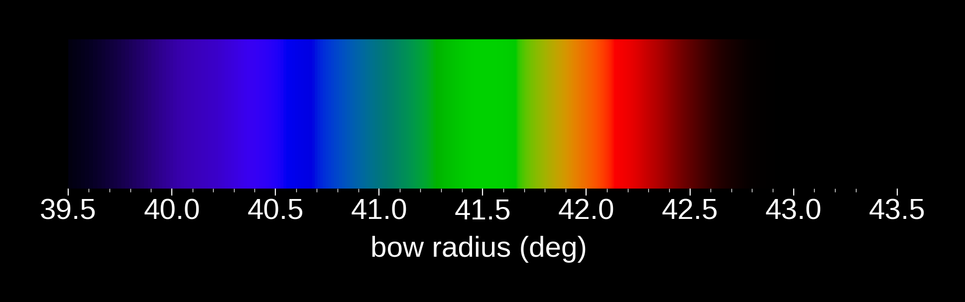
Figure 3. Simulated rainbow as permitted by a conventional computer display. The angles given in the horizontal axis labels are the radii of the different color bands as seen in the sky.
These features make it possible to label each visible band by a single geometric parameter—its angular position in the sky. In this limited but concrete sense, the rainbow evokes a continuous, one-parameter family of light stimuli that readily captures both notions of order and of smooth variability. At the same time, the perceptual distinctions we can reliably make through this variation are comparatively coarse: the bands we recognize are separated by large angular intervals, leaving many intermediate variations that cannot be dependably distinguished.
We could nominate angular radius as a fully self-consistent parameter for constructing more complex color stimuli, but there is a more general purpose alternative—one that detaches the specific phenomenon of rainbows from the underlying properties of light itself.
At this point, physics leads the way. Wave behavior, vector fields, polarization, and frequency (or wavelength)1 collectively compel a more general description of light than we have encountered so far. Among these human artifacts, frequency is a natural candidate to replace angular radius as our organizing parameter, requiring only a modest observation to complete the transition: Without dwelling too much on the optical physics of rainbows, it is a short derivation that shows that an order-preserving, nonlinear mapping from angular radius to frequency equally well labels the spread of rainbow colors in the sky.
A formal name that history has attached to a distribution of radiative power as a function of frequency is the word spectrum. A rainbow is but one example of such a spectrum.
Mathematically, we represent a spectrum by $S(\nu)$. Treated as a distribution in the mathematical sense, $S(\nu)$ specifies how radiative power is distributed across frequency, with dimensions of power per unit frequency.
Now the fun begins. Consider this economically lean, two-parameter family of spectra:
$$ S(a, \nu) = a \delta(\nu - \nu’), \quad a \geq 0, \enspace \nu \geq 0, \enspace \nu’ \geq 0. \tag{1} $$
Physically, this expression represents an electromagnetic disturbance concentrated into a vanishingly narrow range of frequencies and propagating through space with total power $a$:
$$ \int_{0}^{\infty} S(a,\nu)\ d\nu = \int_{0}^{\infty} a\delta(\nu-\nu’)\ d\nu = a. \tag{2} $$
With a concrete proposal for constructing light stimuli in hand, the most direct next step would be to build an optics laboratory and begin exploring the experimental consequences of that proposal. Please get out your checkbooks; I’ll circulate a parts list.
Needless to say, that is not practical here. Instead, we will make use of a surrogate laboratory: a controlled rendering pipeline that allows constructed spectra to be visualized on commonly used displays. While this substitution necessarily introduces compromises, it preserves exactly what we need at this stage—the ability to vary construction parameters systematically and observe how appearance responds.
Sidebar: Real-World Displays
Figure 3 showed a simulated rainbow rendered on a conventional computer display. Each angular radius was computed using geometric optics and the known dispersion relation for water, and each displayed color was approximated by submitting, one by one, the corresponding spectral stimulus (Eq. (1)) through a pragmatic rendering pipeline. The amplitude parameter $a$ was scaled relative to a fixed reference illuminant (CIE D65), which approximates ordinary daylight and provides a consistent baseline for comparison among the rendered colors.
Specifically, each narrowband spectral stimulus was mapped to CIE XYZ tristimulus values using standard color-matching functions, converted to CIE L*a*b* rectangular coordinates, cast into L*C*h° polar coordinates, and then projected into the sRGB gamut for display. This projection procedure is not unique and neither perceptually nor physically canonical; it is chosen solely to make changes in construction visible on a physically realizable color display.
The purpose of this rendering is illustrative. It preserves ordering and local neighborhood relations while making no claims beyond that.
To begin, Figure 4 shows Eq. (1) as a simple 2D plot of the resulting rendered color appearances obtained when $a$ and $\nu’$ are continuously varied.2 Predictably, we see that the amplitude parameter $a$ has the qualitative effect of systematically changing the apparent brightness of the rendered color.
By contrast, for fixed $a$, variation along the frequency axis reveals how strongly equal-power, narrow-band spectral stimuli register with a human observer. In other words, Figure 4 offers a qualitative map of the spectral sensitivity of the human eye.
Figure 5 shows the same family of narrow-band spectral stimuli as Figure 4, but with the frequency-dependent weighting due to the eye’s spectral sensitivity removed from the rendering pipeline. The resulting display values are scaled to their maximum allowed extents so that differences along the frequency axis are more discernible where the eye’s sensitivity is poor.

Figure 5. A display-constrained rendering of the visible spectrum, shown as a sequence of narrow spectral stimuli ordered by frequency. Each band corresponds to a single spectral component; colors are mapped to permissible display values for visualization.
In short, Figure 5 transforms the rainbow into an abstract, synthetic atlas of the human color perceptorium in a two-parameter world.
I brake for rainbows.
The Shape of Color Perception
The prior subsection emphasized construction methodology and deliberately deferred questions of perceptual judgment. Here, that emphasis shifts as we begin to examine what our simple—but objectively arbitrary—two-parameter construction reveals about perception proper.
As an electromagnetic wave, light admits many different properties and physical descriptions. For present purposes, the most useful is frequency: the rate at which the electromagnetic field oscillates in time. Describing light in this way leads to the familiar notion of a spectrum of electromagnetic radiation—a linearly ordered distribution of radiative power as a function of frequency.[^2]
Guided by the hypothesis introduced in the previous section—that the perceptual ordering revealed by the rainbow reflects a deeper and more finely articulated structure—we now adopt frequency (or equivalently wavelength) as a convenient physical parameter for probing that structure. In this operational sense, a rainbow may be treated as a spectrum: an ordered family of narrowly confined light stimuli, with each visible band corresponding to a unique frequency, or a small range of frequencies, as one moves from one radial angle in the sky to another.
Figure 4 shows an alternative rendering of a rainbow, arranged by increasing light frequency. The intent of this figure is not to reproduce the appearance of daylight or of any particular viewing condition, but to provide a controlled baseline for comparing how perceptual discriminability varies along a single ordered parameter.
To that end, two gross sources of perceptual variation have been suppressed: the broad spectral envelope of ordinary daylight, and the frequency-dependent sensitivity of the observer’s eye. The resulting rendering should be understood as an illustrative ordering of narrowly confined stimuli under a fixed, but rational convention,3 not as a claim that any perceptual attribute has been strictly equalized across the full range displayed in the figure. In short, as far as rainbows go, Figure 4 serves as an abstract, synthetic encyclopedia of the human color perceptorium.
We call the array of rainbow color bands a “spectrum,” but look closely: that spectrum is far from uniform, at least so far as our perception is concerned. Notice how much of it is taken up by the red and violet bands compared to, say, the blue and orange bands.
Modern scientific instruments are able to divide a rainbow’s spectrum into millions of distinct spectral points. But despite the convenient physical label — frequency — that maps each color of the rainbow to a single number, human perception knows nothing of these numbers. Instead, it cobbles together its own clunky sensing system, one that throws away most of the physical detail present in the spectrum before it ever reaches consciousness.
Imagine yourself in a color laboratory, and your job is to count how many distinct colors you can sense in a rainbow. You set up a prism as a stand-in for the rainbow, and a narrow viewing slit that you can slide along the spectrum to isolate one thin band of color at a time. You move the slit in small steps, each time asking: “In this new position, does this look any different from the last position?” How many positions of the slit do you end up needing to label and count every distinct color you can perceive?3
Under realistic viewing conditions, the answer is not thousands or millions. It’s on the order of a hundred to maybe a couple hundred distinct spectral colors. Beyond that, the steps become too small to notice. For the sake of having a number to hold in our heads, let’s say there are about 150 distinct rainbow colors you could reasonably count in this experiment.
Yet, the set of colors we can see in the world — skin tones, paints, digital displays, sunsets, fabrics, plastics — is vastly richer than these 150 spectral samples. So there must be something more going on in our perception of color than just sampling frequencies along a line.
I’ll return to where all those other colors come from in a moment; for now, continue the experiment and record every slit location that exhibits a just noticeable difference (JND) from its immediate spectral neighbors. Now you have three ways of labeling the spectrum: the angular radius of the arcs in the sky, the oscillatory frequency of the electromagnetic disturbance, and a perceptual coordinate—the literal count of JNDs you detect as you scan the viewing slit along the spectrum.
If you plot each perceived color linearly against its corresponding frequency, you get a curious curve. It’s not a straight line (Figure 5).4 It bends and stretches in some regions, compresses in others, yielding a shape that has nothing to do with the geometry of the rainbow in the sky. The illustrative color bars in the plot are projections of the line plot’s color toward the two axes. In particular, the ordinate axis exhibits a color bar that uniformly distributes distinguishable colors along its length. The graph depicts our first glimpse of the structure of the perceptual rainbow — as measured via human vision itself. Line color reflects the corresponding spectral color as constrained by the display.

Figure 5. Color discrimination by a standard observer. Psychophysical data demonstrating that the ability of the human eye to distinguish perceptually proximate patches of spectral colors is not uniform with respect to spectral frequency. Line color reflects the corresponding spectral color as constrained by the display. (Graphic is derived from color-matching functions published by the Commission Internationale de l’Éclairage (CIE) in the year 2000.)

Figure 6. Color discrimination by a standard observer. The first derivative of the curve depicted in Figure 5.
Color in Two Dimensions
As established above, the one-dimensional space realized by a rainbow does not exhaust the range of colors permitted by human vision. The question is not merely what colors appear along the rainbow, but how additional perceptible colors arise at all.
One physically motivated operation immediately suggests itself: mixture. If two narrowly confined spectral stimuli are presented together, the resulting color appearance need not correspond to either stimulus alone. Figure 6 explores this operation by combining pairs of spectral colors and rendering the resulting appearances for display.
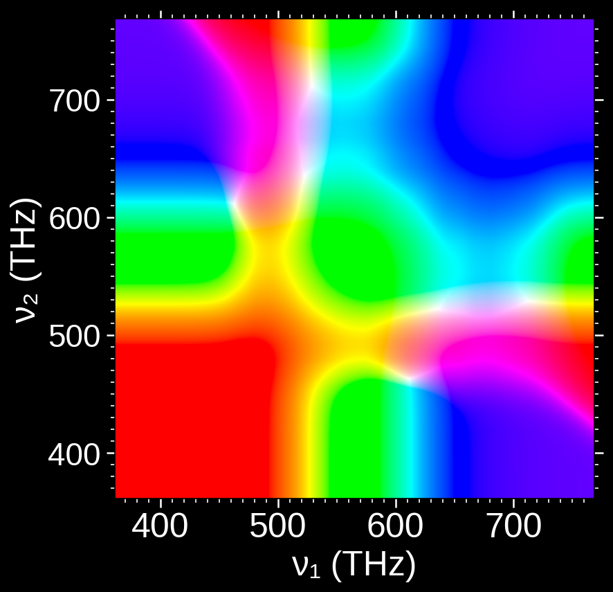
Figure 6. Resulting color obtained by mixing equal fractions of two spectral colors. The points are adapted to a normal display according to the prescription described in Reference 2.
Many of the colors produced by such mixtures resemble familiar regions of the rainbow. But careful inspection reveals something more consequential: some mixtures produce colors that cannot be matched to any single spectral band.
Figure 7 isolates one such case. The lower bar shows the appearance produced by combining two spectral stimuli (470 THz and 661 THz), constructed with identical spectral power at the source. No color in the reference rainbow above it corresponds perceptually to this mixture.

Figure 7. Mixing of two spectral colors 470 Thz and 661 THz can produce new colors not present in the rainbow spectrum.
This failure of closure is decisive. If the set of perceptible colors were truly one-dimensional, mixtures of spectral colors would remain within that set. They do not. The appearance of genuinely new colors under mixture forces an expansion of the space: a single ordered parameter is no longer sufficient.
At minimum, more than one independent degree of freedom is required.
Importantly, this conclusion does not require us to assume that the additional degree of freedom has the same structure as the spectral ordering. What mixture introduces is not a second copy of the rainbow, but a new mode of variation. That mode exhibits many of the same local perceptual features—smooth transitions, neighborhoods, and limited discriminability—but its global structure need not mirror that of the spectral axis.
Local similarity does not imply global equivalence.
What mixture establishes is that the space of color appearances is locally coherent along multiple directions of variation, while remaining globally constrained and asymmetric. The rainbow, then, is not the space of color, but a one-dimensional slice through it.
Frequency is a more natural unit to label spectral properties, and I will be using that unit uniformly throughout. This decision stands contrary to convention in modern commercial practice and engineering, where wavelength is the preferred unit. This will not be the only occasion I go against convention. ↩︎
The knowledgeable reader will note that I have left unspecified the viewing conditions under which Figures 3 and 4 are rendered. At this stage, only the structural notions of order and neighborhood are at issue; these are stable across a wide range of viewing conditions and do not depend on fine-grained control of the optical source. ↩︎
For the curious: Figure 4 is generated by mapping $\delta$-function spectral power distributions (one per frequency sample) into CIE XYZ tristimulus values using standard color-matching functions, converting those values into CIE L*a*b*, and projecting the result into the sRGB gamut in a manner that preserves hue and maximizes saturation within the available gamut. This final projection step is neither perceptually nor physically self-consistent, and no uniqueness is claimed for it; other display mappings could be justified equally well. The pipeline is a pragmatic choice for visualization, not a theoretical commitment. ↩︎ ↩︎
Plotted data derived from ISO/CIE 11664-6:2022 (formerly ISO/CIE 11664-6:2014), “Colorimetry — Part 6: CIEDE2000 colour-difference formula." ↩︎